Steampunk Challenge - Final Submission
Hooray, I managed to get something done enough to enter as a final image!
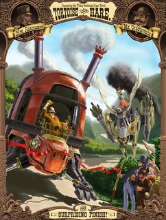
There are a lot of things that I'm going to go back and fix in this, but I'm very happy with how it came out. I hope you like it too.
Now it's time to decompress and get away from this computer.

There are a lot of things that I'm going to go back and fix in this, but I'm very happy with how it came out. I hope you like it too.
Now it's time to decompress and get away from this computer.
Labels: challenge, entry, final, hare, painting, steampunk, tortoise
posted by Jeff Z at 3:54 PM
![]()

12 Comments:
Looks great! I made it my desktop!
did you manage to get it uploaded?
Frickin AWESOME work Jeff!!!
I've been following along your blog since you started posting about the steampunk challenge. It's very cool how you have posted the step-by-step of your progress, because it really shows a non-artistic person the work that goes into a picture like that. before, i had no conception of all the effort it took to produce it. now i can appreciate the details, especially the brickwork on the turtle. i was not expecting the brick at all, so when i saw the addition of it, i was quite impressed by the low-tech steampunk look it gave. (so... turtleish? hah) my only complaint is massive detailing on the hare, while the hare is further back. i couldnt make out much detail at all, which is a shame, considering the effort you put in on the hare.
Leslie is right - I think you may have put a bit too much detail on the hare, and the stark contrast of the black smoke against the otherwise light image pulls the viewer's attention way too much on the hare rather than the tortoise.
When I'm viewing this, my eye is strongly drawn toward the right (to the hare), which is confusing as it seems you want the focus to be on the tortoise (with is taking up most of the image).
Thanks everyone! I did manage to get it uploaded in time to qualify for the contest, so *WHEW*
Leslie, your complaint about the Hare would be my complaint as well - I definitely worked harder than I needed to. I'm still learning how to balance which things get the most (and the tightest-rendered) detail in illustrations like this. So I was having fun doing all the tight stuff on the hare and spent too much time on it - I should have been spending it on the Tortoise, but I was having difficulty seeing where the Tortoise was going to go in my mind, so I was putting it off until I had a clearer direction.
In this case, there is also the issue of the resolution of the image that you're seeing here on the site vs. the resolution required for the final piece. Here on the blog it's only 800 pixels high; the image I submitted is at print resolution, 3600+ pixels at 300ppi. You *will* be able to see all that detail if this is printed in a book or on a poster.
Anyway, I did learn more about prioritizing things, so hopefully next time I'll be able to focus the most attention where it's needed.
Thanks again for all the nice feedback, and thanks for reading my blog. :)
Hi Anonymous #2, hmmm... argh, you're right. The smoke is too dark and it draws the eye.
Oh well, I'll fix it for the next iteration. Too late to fix it for the contest. :\
I see what you are doing with the smoke, giving the hare the dark, wasteful smoke. I think I would like starker colors on the hare, because the pale yellow just doesn't do it justice. maybe that would bring out some detail? and make it look shinier and sleeker even?
i like what you did with the smoke, because it seems dark, wasteful, and inefficient, especially compared to the turtle. i think maybe starker colors for the hair would help; the pale yellow just doesn't do it justice. maybe that would bring out the detailing more, or even make it look high-tech sleek and shiny?
I like this a lot, Jeff. imho if you lightened the smoke colors it would balance out the picture a bit more to emphasize the turtle. Tho it is quite awesome. I am an artist too and I completely understand about putting off some things until the end. You get wrapped up in one section and sometimes end up lightening up the details on other areas. I think it is balanced well other than the smoke. The stark contrast of the smoke pulls the eye back but it also gets you to look more at that background detail, so maybe it was a little on purpose? :O
Keep up the awesome work ;D
(wait...is that Abe Lincoln in the front?)
I can't believe I missed this back in Jan. I LOVE the way this turned out. I really enjoy this piece! :D
this piece is really fun and really good. really nice lighting and design
Post a Comment
<< Home