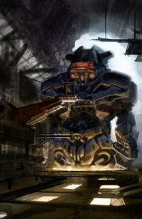
Trying some new techniques
I'm working on another "master copy," this time following Khang Le's demo from his CDA seminar:

This is progress after about 4 hours. You can see the original image that Khang did for his demo here. (Scroll down to the second image, you can click to enlarge.) You'll see that I'm not trying to copy it as closely as I did on my Syd Mead master copy, but I'm starting with the same subject ("giant robot factory") and composition. It's an exercise for me in 3 major areas: using some specific photo-collage and layering techniques that Khang showed us; creating convincing, realistic lighting; and finally working better with color, specifically in contrasting hue and saturation in addition to the more basic contrast of value (light and dark). Sticking with the same subject and basic layout just makes it so I can not think about those things and concentrate on what I'm trying to improve.
Normally I don't like using photo-collage, grabbing various images and pasting them together in an image to quickly generate realistic textures and design elements. It's a common concept art technique used to speed up production, yes, but I think it takes the life out of the work, makes it too obviously artificial. For me personally it really kills my enjoyment of the image-making process when I'm forced to cobble together photos like a jigsaw puzzle.
However, Khang's style of using photos changed my mind about it, because it's not used blatantly, yet it still adds a lot of texture, structure and interest to an image very quickly. Using his method I was able to come up with stuff very quickly; most of what you see here was done in only about 2 hours. Had I just straight painted it, this level of detail would have taken at least a week, most likely.
Another thing Khang did that I really liked was how he never went "backwards" down his Photoshop layers. What I mean is that any time he needed to switch painting tasks, like going from painting shadows to painting highlights, he would add a layer and do it on the new layer. He would keep adding layers, using different composite methods (Screen, Multiply, Color, Overlay etc.) to achieve the goal of the moment, then move on to yet another layer.
What many artists do is to make one basic midtone layer, then a Multiply layer for shadows and a Screen layer for highlights, and then keep going back and forth between those layers to work. Or, they will completely paint each separate section on a separate layer, making new layers for each different thing they try, so at any point they can go backwards if they don't (or more importantly the art director doesn't) like where it's going. While these are legitimate techniques, I think both ways slow you down a lot, and especially the second one makes you very cautious (at least that's what it does to me), which I think is antithetical to creativity and enjoyment.
I like that Khang's layer method keeps you always moving forward, forward, forward. You never "go back" to an old layer to paint something out, you just make a new layer (use your keyboard shortcuts! Ctrl+Alt+Shift+N or Cmd+Opt+Shift+N, for speed!) and keep going "forward" and "up." It's weird, but psychologically it really works to keep you going and flowing. Khang flattens out the image from time to time and saves it as a sequentially-numbered name (like "image_01" etc.), so he keeps that option of going back *if* the AD wants a major change, which is good. The only downside to rapid layering is that you end up with a file with dozens of unhelpfully-named "Layer 26," "Layer 19," "Layer 67," and so on. Might be a good idea to give them some kind of name so you can find stuff to change faster.
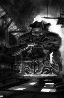
The last thing like that Khang does is he always puts in as the very top layer an Adjustment:Hue/Saturation Layer with the Saturation turned all the way down to zero. By turning it on and off, you can quickly check to see if you're maintaining your value relationships correctly, which is critical to making your composition read. Here's what my image looks like with zero saturation:

Looks like it's reading pretty well. I need a bit more of a gradient from bottom to top on the robot figure, the upper parts seem like they're reflecting more of the lower light source than they should. It's not as obvious in the color version but it's very plain here. The lighting won't look realistic if it doesn't fade naturally with distance from the source, so I will need to deal with that as I go forward.
Khang's techniques are very different from another artist whose techniques I use a lot: Ryan Church, who generally works in very few layers and flattens the image over and over again without saving as a new file. That's another way to always go forward, but I sometimes find myself getting mired in tweaking detail. I'm not as confident in painting as Ryan is... but then, he's got a good 15 years on me, probably a bit more. :) I'm better doing it that way if I've done a tight line drawing first; Khang's method allows me to start from a simple light/dark mass layout and build without a drawing, but still get interesting detail and shape in a very short time. Good to know.
Why another master copy? Baby steps. I wanted to get some experience using Khang's technique and "processing" the image-making in my brain before I start trying to apply this to some original works. Actually, I have already applied it to an illustration assignment with success, but I have to wait to show you that until the project is published.
So hey thanks Khang, if you're out there! :)
I have Dominance War IV challenge to do coming up, and I'll be painting it live on UStream again, so keep an eye on this blog or follow me on UStream, Twitter or Facebook to know the schedule.

This is progress after about 4 hours. You can see the original image that Khang did for his demo here. (Scroll down to the second image, you can click to enlarge.) You'll see that I'm not trying to copy it as closely as I did on my Syd Mead master copy, but I'm starting with the same subject ("giant robot factory") and composition. It's an exercise for me in 3 major areas: using some specific photo-collage and layering techniques that Khang showed us; creating convincing, realistic lighting; and finally working better with color, specifically in contrasting hue and saturation in addition to the more basic contrast of value (light and dark). Sticking with the same subject and basic layout just makes it so I can not think about those things and concentrate on what I'm trying to improve.
Normally I don't like using photo-collage, grabbing various images and pasting them together in an image to quickly generate realistic textures and design elements. It's a common concept art technique used to speed up production, yes, but I think it takes the life out of the work, makes it too obviously artificial. For me personally it really kills my enjoyment of the image-making process when I'm forced to cobble together photos like a jigsaw puzzle.
However, Khang's style of using photos changed my mind about it, because it's not used blatantly, yet it still adds a lot of texture, structure and interest to an image very quickly. Using his method I was able to come up with stuff very quickly; most of what you see here was done in only about 2 hours. Had I just straight painted it, this level of detail would have taken at least a week, most likely.
Another thing Khang did that I really liked was how he never went "backwards" down his Photoshop layers. What I mean is that any time he needed to switch painting tasks, like going from painting shadows to painting highlights, he would add a layer and do it on the new layer. He would keep adding layers, using different composite methods (Screen, Multiply, Color, Overlay etc.) to achieve the goal of the moment, then move on to yet another layer.
What many artists do is to make one basic midtone layer, then a Multiply layer for shadows and a Screen layer for highlights, and then keep going back and forth between those layers to work. Or, they will completely paint each separate section on a separate layer, making new layers for each different thing they try, so at any point they can go backwards if they don't (or more importantly the art director doesn't) like where it's going. While these are legitimate techniques, I think both ways slow you down a lot, and especially the second one makes you very cautious (at least that's what it does to me), which I think is antithetical to creativity and enjoyment.
I like that Khang's layer method keeps you always moving forward, forward, forward. You never "go back" to an old layer to paint something out, you just make a new layer (use your keyboard shortcuts! Ctrl+Alt+Shift+N or Cmd+Opt+Shift+N, for speed!) and keep going "forward" and "up." It's weird, but psychologically it really works to keep you going and flowing. Khang flattens out the image from time to time and saves it as a sequentially-numbered name (like "image_01" etc.), so he keeps that option of going back *if* the AD wants a major change, which is good. The only downside to rapid layering is that you end up with a file with dozens of unhelpfully-named "Layer 26," "Layer 19," "Layer 67," and so on. Might be a good idea to give them some kind of name so you can find stuff to change faster.
The last thing like that Khang does is he always puts in as the very top layer an Adjustment:Hue/Saturation Layer with the Saturation turned all the way down to zero. By turning it on and off, you can quickly check to see if you're maintaining your value relationships correctly, which is critical to making your composition read. Here's what my image looks like with zero saturation:

Looks like it's reading pretty well. I need a bit more of a gradient from bottom to top on the robot figure, the upper parts seem like they're reflecting more of the lower light source than they should. It's not as obvious in the color version but it's very plain here. The lighting won't look realistic if it doesn't fade naturally with distance from the source, so I will need to deal with that as I go forward.
Khang's techniques are very different from another artist whose techniques I use a lot: Ryan Church, who generally works in very few layers and flattens the image over and over again without saving as a new file. That's another way to always go forward, but I sometimes find myself getting mired in tweaking detail. I'm not as confident in painting as Ryan is... but then, he's got a good 15 years on me, probably a bit more. :) I'm better doing it that way if I've done a tight line drawing first; Khang's method allows me to start from a simple light/dark mass layout and build without a drawing, but still get interesting detail and shape in a very short time. Good to know.
Why another master copy? Baby steps. I wanted to get some experience using Khang's technique and "processing" the image-making in my brain before I start trying to apply this to some original works. Actually, I have already applied it to an illustration assignment with success, but I have to wait to show you that until the project is published.
So hey thanks Khang, if you're out there! :)
I have Dominance War IV challenge to do coming up, and I'll be painting it live on UStream again, so keep an eye on this blog or follow me on UStream, Twitter or Facebook to know the schedule.
Labels: concept, design, painting, Photoshop, practice, speedpaint

1 Comments:
I really like this, and I LOVE that you were able to accomplish this so quickly.
I like your robot better than the robot in the example, in terms of structure - the original looks excessively rounded or organic somehow. Maybe that was the point, but I still prefer yours.
You should use Khang Le's technique(s) more often - the time-saving elements appear to really free you to create interesting images.
In other words, I like where you're going with this!
-TGF (or is it TW now?)
Post a Comment
<< Home