"9" Movie Game Art
Everyone's heard by now of the new movie just out last weekend called "9," created and directed by Shane Acker and produced by Tim Burton and Timur Bekmambatov. There was originally going to be a video game based on the movie (as most animated movies have these days), but unfortunately because the publisher of it went under, the partly-completed game was scrapped, almost a year ago.
You may remember that's about when I got laid off; it's not a coincidence. One of the projects I was working on was indeed the "9" movie game, and when it was cancelled there just wasn't enough work to keep us all on staff.
Now that the movie is out, here's a bunch of the work I did on it:
Character Designs
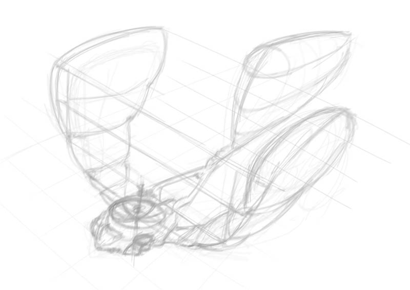
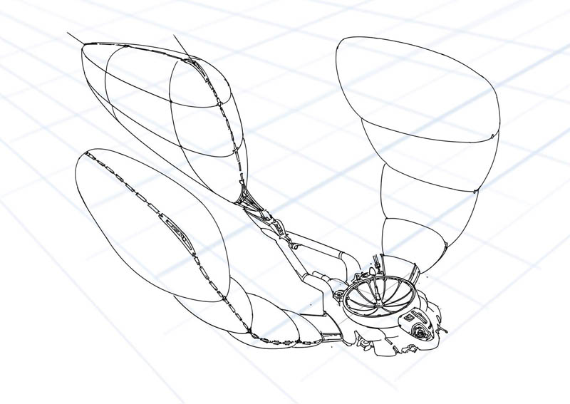
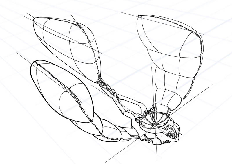
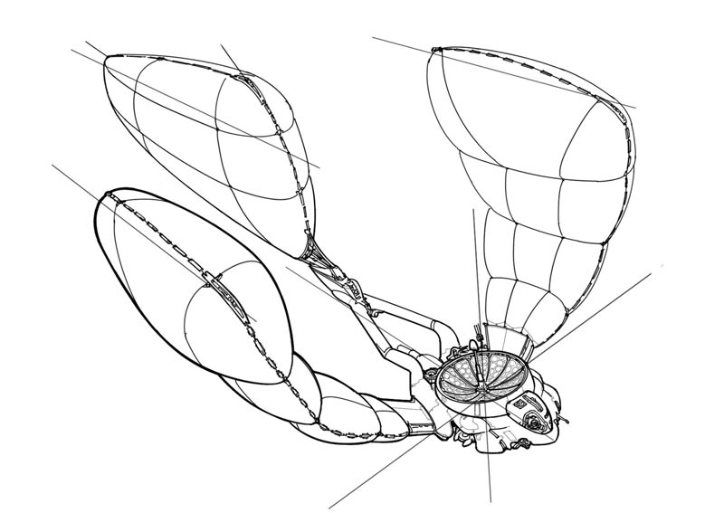
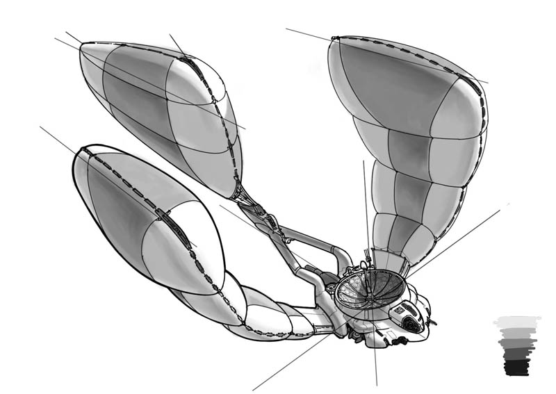
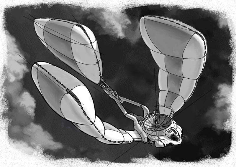
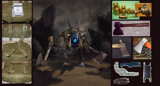
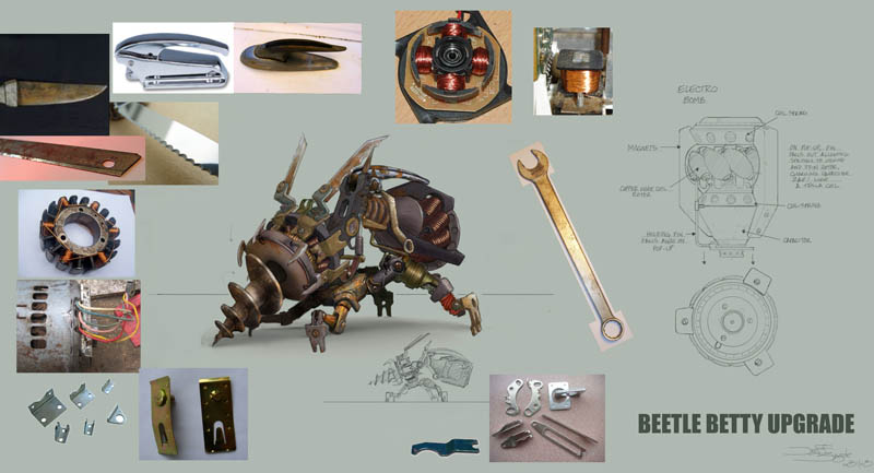
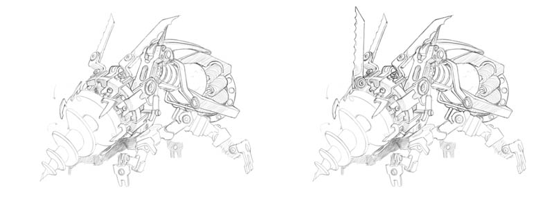
Lead concept artist Miguel Lleras created a creature called the "Beetle Betty," which would burrow into the ground headfirst and then pop up an explosive device, like the awful "bouncing betty" anti-personnel land mine. Based on his design, I had to come up with an "upgrade" to this beast the final of which is here with reference photos for various parts:
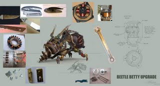
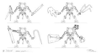
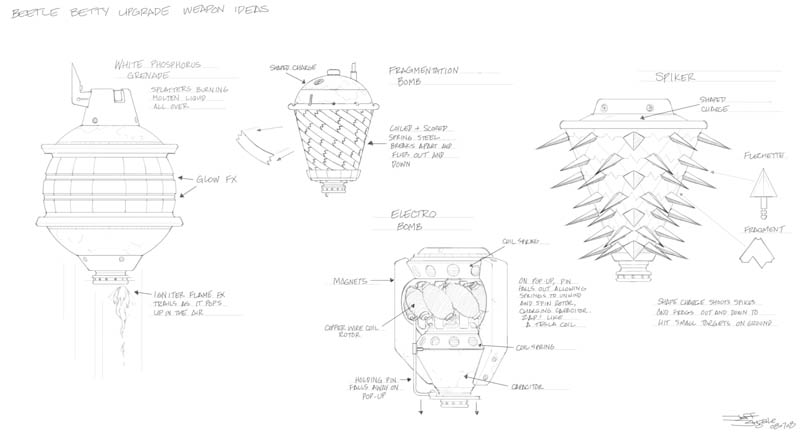
The first thing to figure out was what the upgraded bomb would be. I had some ideas for nasty fragmentation devices and also an electrical "lightning bolt" weapon:

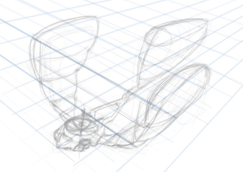
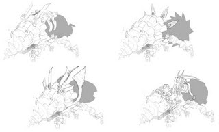
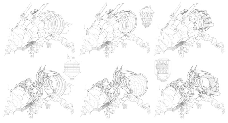
Then I did some design sketches for the upgraded beast with the different bomb ideas attached:
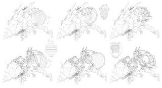
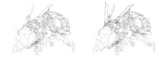
They chose the electrical device and asked for a couple of specific options for the creature shape. From these two they chose the final design above:
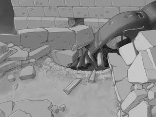
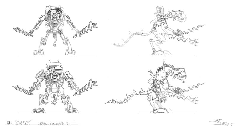
We also needed an upgrade for a beast called the Rat Stalker, again with heavier weaponry and a different skull design than the original. I had a body design to work from, so first I tried a bunch of different small animal skulls:
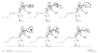
Then I tried out a series of new weapons for it to carry:

They decided to go with drills and a ferret skull, which resulted in this final art:
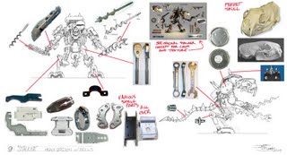
All the characters in 9 are assembled from various small machine parts and random tools and bits of junk, so I found a lot of reference on the Internet for all the various bits. It was fun using them as puzzle pieces to build new monsters.
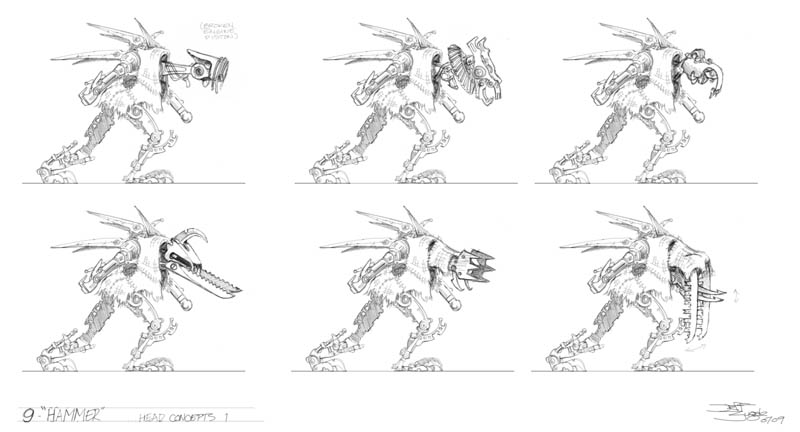
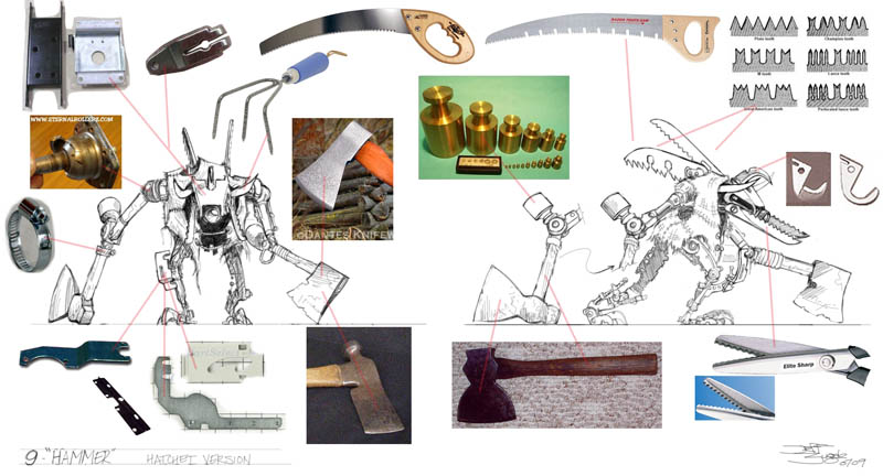
Lastly, we had a Hammer Beast which needed an upgrade. I started with new head designs:

And then again started messing with several different types of weapons:
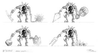
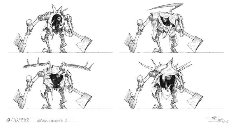
Then it dawned on me that the obvious choice to upgrade hammers was hatchets!
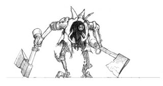
At the same time I worked on some different front view designs to try to give it a distinctive silhouette:

After review, here's the final approved design, with lots of reference to help the modelers with the color and textures:

Environment Designs
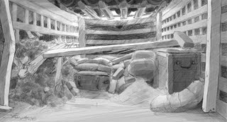
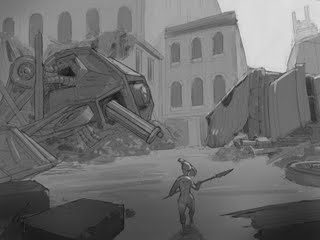
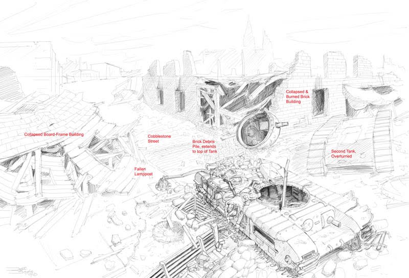
The world of "9" is a post-apocalyptic urban warfare zone, basically a bombed out city based in a time period somewhere between WWI and WWII. One level design I worked on was an abandoned battle line trench with a destroyed tank sitting astride it:
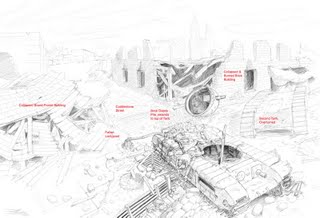
The player would travel through the trench and then up over the top of the tank. They could see quite a bit of the surrounding area so it all had to be figured out. After climbing over the tank, the player would wind up back under it from the other side in this area, where they'd face the level boss. You can see the tank treads are the ceiling of the room:
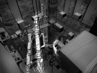
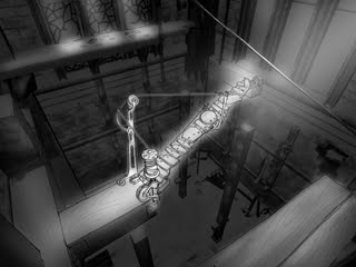
The next environment is inside a church bell tower. The player would have to climb the inside of the tower - the characters are only 6-8 inches tall, but the buildings are human-sized - by negotiating various paths up the walls, and by activating catwalks in various spots. I sketched in some of the catwalk paths over the actual 3D model of the tower interior:
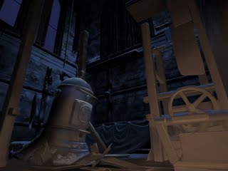
And here's an unfinished painting I was working on to help establish the lighting mood at the base of the tower:
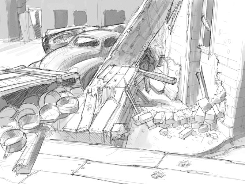
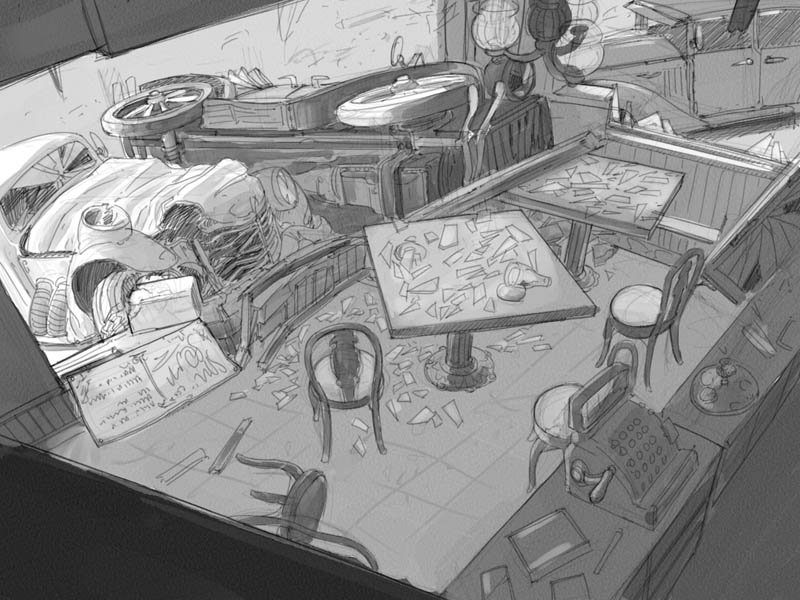
The last environment I did was a full level design called the War Torn Street. These show all the areas the character would be moving through from start to finish. In most cases the character would be moving from left to right:
Exterior cafe:

Interior cafe:
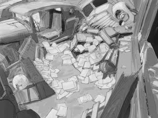
Out the other side of the cafe (right to left from windowsill thru the car interior):
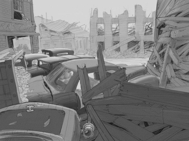
Over the car tops from left to right:

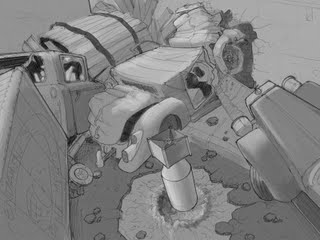
Through a large open area featuring a destroyed War Machine - in this level you play as the character shown here called "7," played by Jennifer Connelly in the film:
Over and through another car, then past an unexploded bomb (yikes!):
Through a winding path and another car:
Then to this arena area to face the level boss:
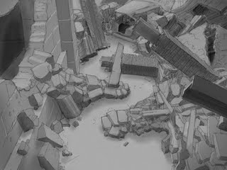
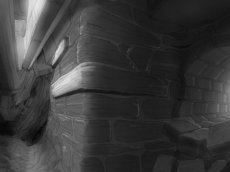
And once you beat him, down through the last smashed car into the dry sewer pipe that leads into the Cathedral:

I should mention that all this pencil-looking stuff was done using Painter IX's pencil brush tool, which is one of my favorite digital brushes. The graytones were all done with Digital Watercolor brushes.
Storyboards
These are really "action boards," just used to demonstrate various gameplay elements to show the publisher, designers, modelers and animators the kind of things the character is supposed to do.
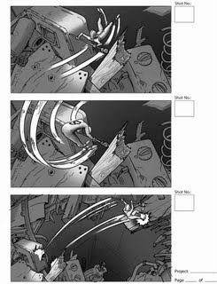
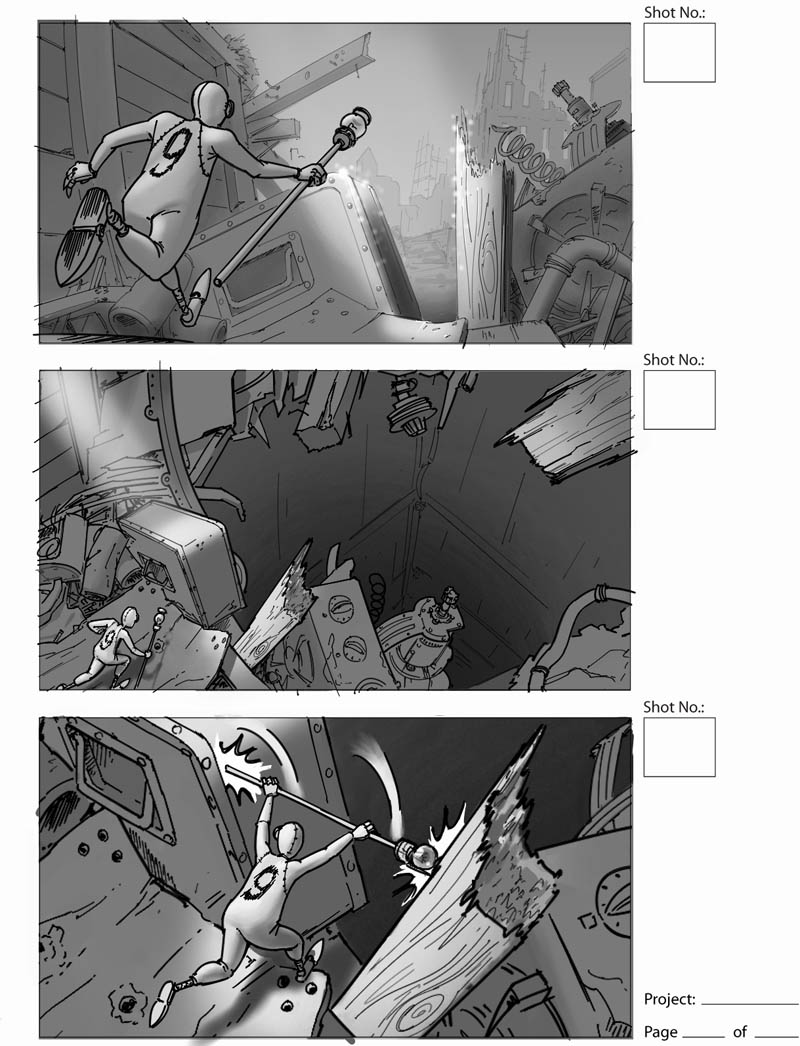
They wanted the main character to be able to use his staff to wedge into some kinds of gateways, to do a kind of gymnastic bar vault move to get over places too wide to jump across:

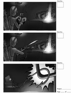
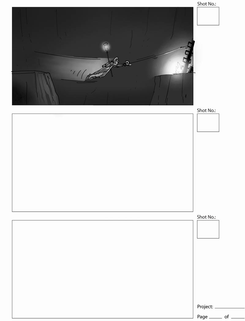
A longer sequence showing many things 9 could do. First he finds himself in a dark place, so he turns on a light on his staff:
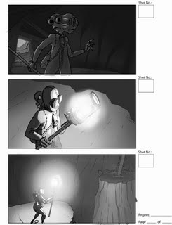
He sees he has to cross a chasm, but it's dark over there; he uses a kind of crossbow to fire a lit match to the other side to light the way:
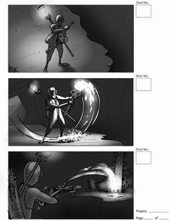
And finally loads the crossbow with a fishhook and line so he can swing across:

This world that Shane Acker created is both fun to play around in and really spooky and strange. It's too bad the game couldn't be finished, I think the story and obviously the whole CG-made nature of the world actually lend itself well to be done in video game format - much more so than a lot of other movie games. This art was actually really enjoyable to work on and was a highlight of my time at that job, even though it was related to the end of it, heh...
I haven't seen the film yet, hopefully I can go this weekend. Apparently it's doing pretty well, surprisingly well! On the project I've been working on the last few weeks, I'm doing concept art and working with a very cool storyboard artist who did a lot of work on the 9 film, working directly with Shane Acker, named Régis Camargo. Check out his blog where he's just posted a bunch of the storyboards he did for the film! He's an excellent animator, too, and has done two short films all on his own... awesome.
You may remember that's about when I got laid off; it's not a coincidence. One of the projects I was working on was indeed the "9" movie game, and when it was cancelled there just wasn't enough work to keep us all on staff.
Now that the movie is out, here's a bunch of the work I did on it:
Character Designs
Lead concept artist Miguel Lleras created a creature called the "Beetle Betty," which would burrow into the ground headfirst and then pop up an explosive device, like the awful "bouncing betty" anti-personnel land mine. Based on his design, I had to come up with an "upgrade" to this beast the final of which is here with reference photos for various parts:
The first thing to figure out was what the upgraded bomb would be. I had some ideas for nasty fragmentation devices and also an electrical "lightning bolt" weapon:
Then I did some design sketches for the upgraded beast with the different bomb ideas attached:

They chose the electrical device and asked for a couple of specific options for the creature shape. From these two they chose the final design above:
We also needed an upgrade for a beast called the Rat Stalker, again with heavier weaponry and a different skull design than the original. I had a body design to work from, so first I tried a bunch of different small animal skulls:

Then I tried out a series of new weapons for it to carry:

They decided to go with drills and a ferret skull, which resulted in this final art:

All the characters in 9 are assembled from various small machine parts and random tools and bits of junk, so I found a lot of reference on the Internet for all the various bits. It was fun using them as puzzle pieces to build new monsters.
Lastly, we had a Hammer Beast which needed an upgrade. I started with new head designs:
And then again started messing with several different types of weapons:

Then it dawned on me that the obvious choice to upgrade hammers was hatchets!

At the same time I worked on some different front view designs to try to give it a distinctive silhouette:
After review, here's the final approved design, with lots of reference to help the modelers with the color and textures:

Environment Designs
The world of "9" is a post-apocalyptic urban warfare zone, basically a bombed out city based in a time period somewhere between WWI and WWII. One level design I worked on was an abandoned battle line trench with a destroyed tank sitting astride it:
The player would travel through the trench and then up over the top of the tank. They could see quite a bit of the surrounding area so it all had to be figured out. After climbing over the tank, the player would wind up back under it from the other side in this area, where they'd face the level boss. You can see the tank treads are the ceiling of the room:

The next environment is inside a church bell tower. The player would have to climb the inside of the tower - the characters are only 6-8 inches tall, but the buildings are human-sized - by negotiating various paths up the walls, and by activating catwalks in various spots. I sketched in some of the catwalk paths over the actual 3D model of the tower interior:


And here's an unfinished painting I was working on to help establish the lighting mood at the base of the tower:

The last environment I did was a full level design called the War Torn Street. These show all the areas the character would be moving through from start to finish. In most cases the character would be moving from left to right:
Exterior cafe:
Interior cafe:
Out the other side of the cafe (right to left from windowsill thru the car interior):

Over the car tops from left to right:
Through a large open area featuring a destroyed War Machine - in this level you play as the character shown here called "7," played by Jennifer Connelly in the film:

Over and through another car, then past an unexploded bomb (yikes!):

Through a winding path and another car:

Then to this arena area to face the level boss:

And once you beat him, down through the last smashed car into the dry sewer pipe that leads into the Cathedral:
I should mention that all this pencil-looking stuff was done using Painter IX's pencil brush tool, which is one of my favorite digital brushes. The graytones were all done with Digital Watercolor brushes.
Storyboards
These are really "action boards," just used to demonstrate various gameplay elements to show the publisher, designers, modelers and animators the kind of things the character is supposed to do.
They wanted the main character to be able to use his staff to wedge into some kinds of gateways, to do a kind of gymnastic bar vault move to get over places too wide to jump across:

A longer sequence showing many things 9 could do. First he finds himself in a dark place, so he turns on a light on his staff:

He sees he has to cross a chasm, but it's dark over there; he uses a kind of crossbow to fire a lit match to the other side to light the way:

And finally loads the crossbow with a fishhook and line so he can swing across:

This world that Shane Acker created is both fun to play around in and really spooky and strange. It's too bad the game couldn't be finished, I think the story and obviously the whole CG-made nature of the world actually lend itself well to be done in video game format - much more so than a lot of other movie games. This art was actually really enjoyable to work on and was a highlight of my time at that job, even though it was related to the end of it, heh...
I haven't seen the film yet, hopefully I can go this weekend. Apparently it's doing pretty well, surprisingly well! On the project I've been working on the last few weeks, I'm doing concept art and working with a very cool storyboard artist who did a lot of work on the 9 film, working directly with Shane Acker, named Régis Camargo. Check out his blog where he's just posted a bunch of the storyboards he did for the film! He's an excellent animator, too, and has done two short films all on his own... awesome.
Labels: 9, concept, design, environment, feature, game, movie, pencil, sketches, storyboards
posted by Jeff Z at 11:02 PM
9 comments
![]()