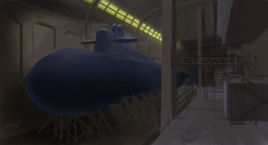
May 27 Paint
Started working on another one tonight. This time I'm doing incremental saves at different progress points. I started with a favorite thumbnail I've had laying around for more than a year:
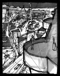
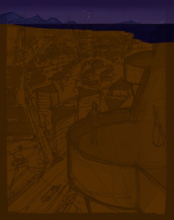
Open in Painter, lift image to its own layer, set to Multiply, then block in base colors on Canvas layer:
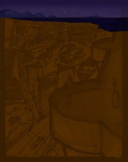
Block in foreground balcony and some rooftops in the midground, create slight gradient on ground (darkens with distance):
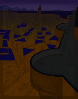
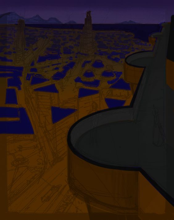
Add more rooftops out to shoreline, select rooftops with Magic Wand and repeat gradient to distance:

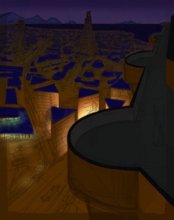
Add some ground light sources with Glow brush - brightest spot will be the focal point of the image:
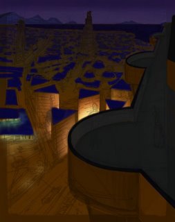
Add light to foreground balcony, also some to distant tall buildings:
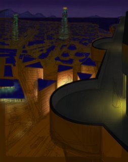
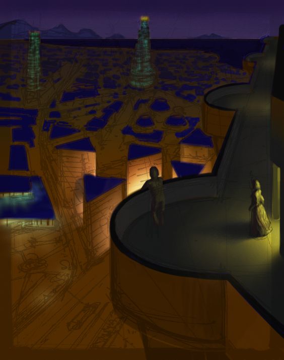
Final step for tonight, add two figures on the balcony

The brightest light in the image is only about a 25% value - not even close to white. None of the other lights is brighter than 50%. I'm trying to make my #1 read be the character whose head is in front of the bright light, #2 should be the other character near the doorway approaching the main character, and #3 should take the viewer's eye on a little tour of the city lights before coming right back to the #1 read.
I'm thinking that with the #1 read being fairly close to the horizontal center, I'm probably going to want to move the distant tall building right above him over to the left some - getting too much of a vertical line there I think.

Open in Painter, lift image to its own layer, set to Multiply, then block in base colors on Canvas layer:
Block in foreground balcony and some rooftops in the midground, create slight gradient on ground (darkens with distance):

Add more rooftops out to shoreline, select rooftops with Magic Wand and repeat gradient to distance:
Add some ground light sources with Glow brush - brightest spot will be the focal point of the image:
Add light to foreground balcony, also some to distant tall buildings:

Final step for tonight, add two figures on the balcony
The brightest light in the image is only about a 25% value - not even close to white. None of the other lights is brighter than 50%. I'm trying to make my #1 read be the character whose head is in front of the bright light, #2 should be the other character near the doorway approaching the main character, and #3 should take the viewer's eye on a little tour of the city lights before coming right back to the #1 read.
I'm thinking that with the #1 read being fairly close to the horizontal center, I'm probably going to want to move the distant tall building right above him over to the left some - getting too much of a vertical line there I think.
Labels: environment, painting, portfolio
posted by Jeff Z at 12:22 AM
1 comments
![]()