Thursday, June 04, 2009

Design Project: Dropship

Here's the digital-marker version of the design drawing:


Yeah, that's better. Is this a perfect drawing? Of course not. I think if I turned it in to Scott Robertson, it would get a C-minus because of some technical flaws. However, it says what it needs to say, I think.

Oops, forgot to drop in some people for scale. Will update later and repost.

Labels: , , , , ,

Tuesday, May 19, 2009

Sir Sketchalot

While you're waiting for the next comic, here's a few things from the giant stack of sketching I've been doing, on paper with markers:

Automated street vacuum:


Some kinda machine-y thing:


Dog-like mech:


I'm both going back to some of my sketching roots and working to be in Doug Chiang space. Trying to learn to get the same kind of look that Chiang gets with markers, which seems very specific - haven't quite found it yet. He's working the marker in a way that gets a crisp smooth wash.

Lots more to come, soon.

Labels: , , , ,

Saturday, April 04, 2009

Trying some new techniques

I'm working on another "master copy," this time following Khang Le's demo from his CDA seminar:


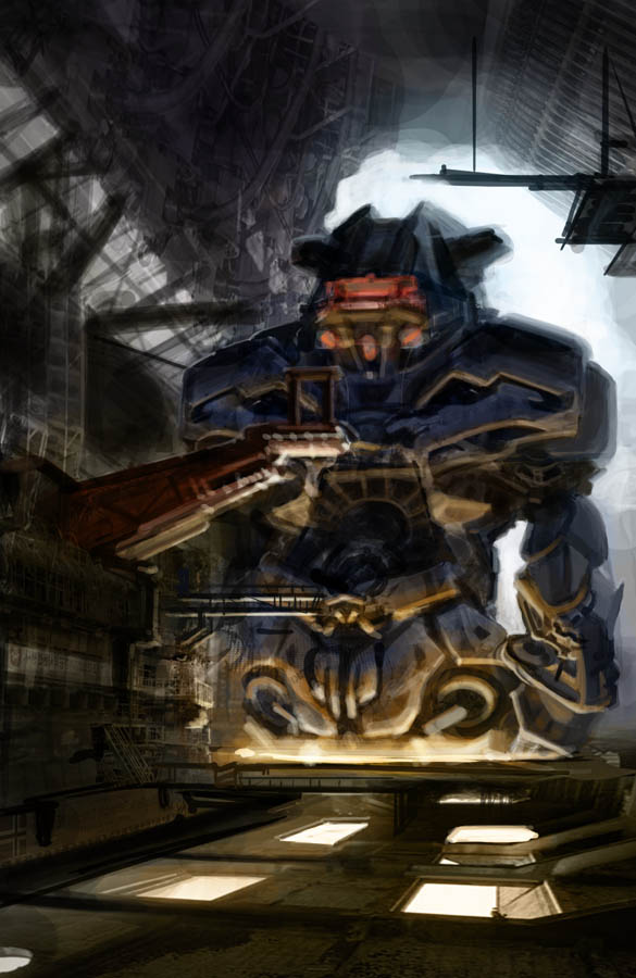
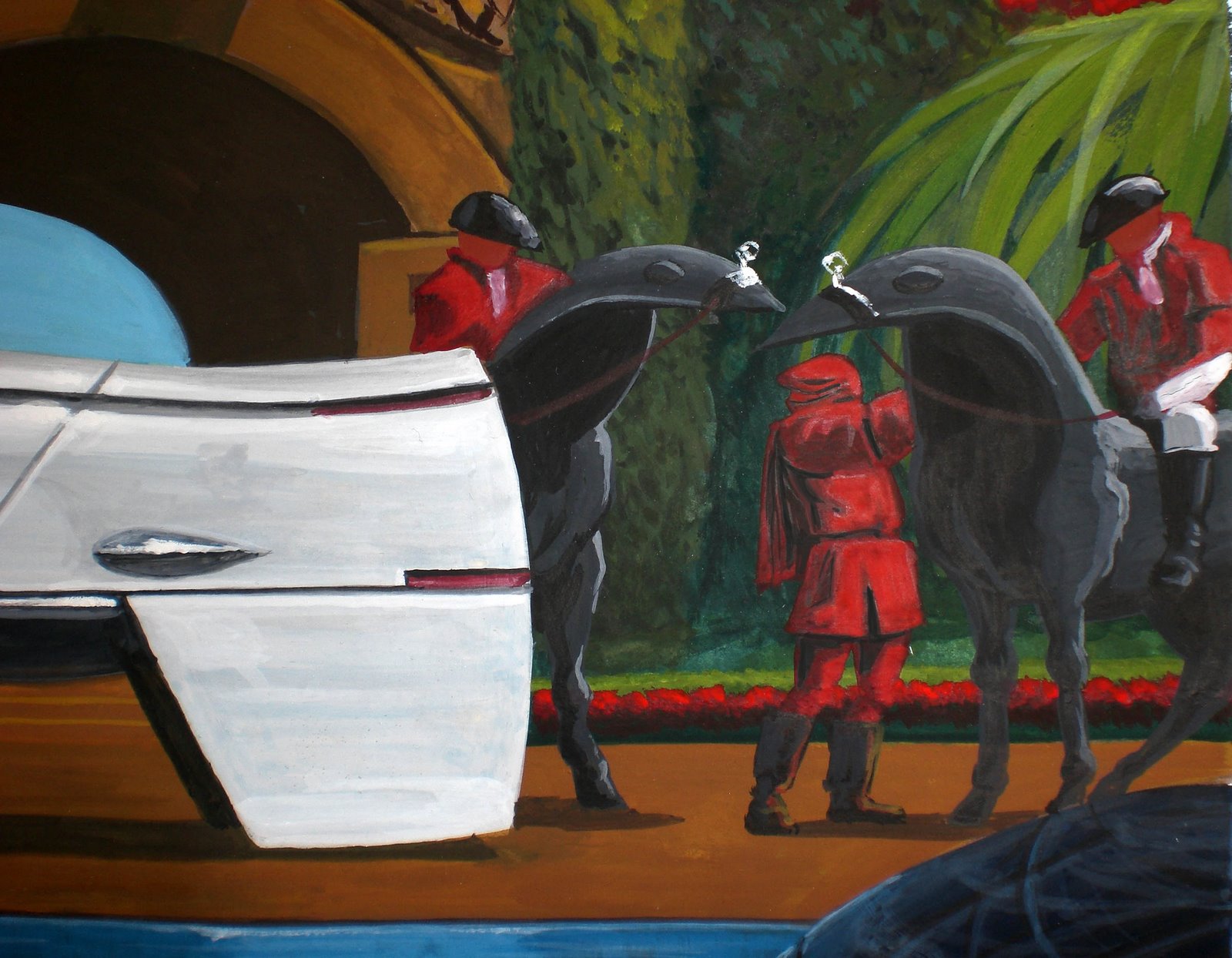
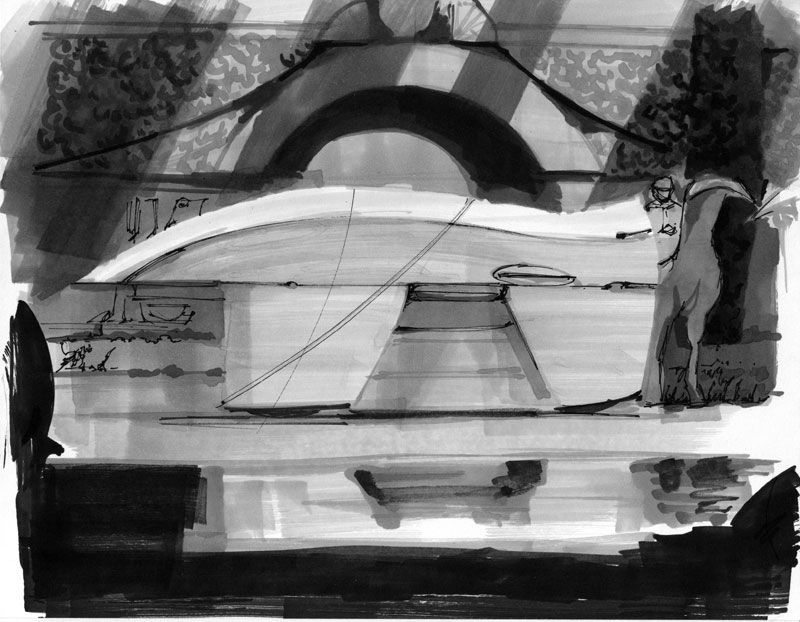
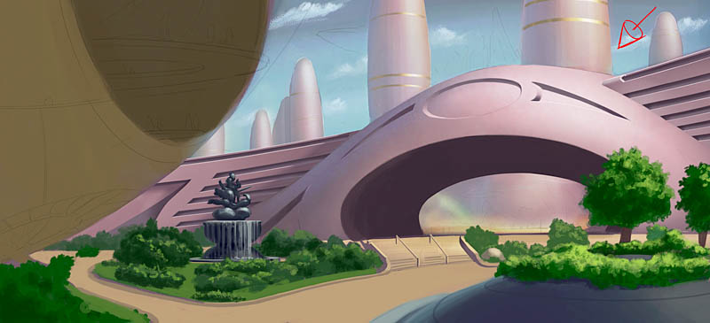
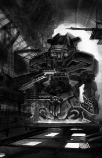
This is progress after about 4 hours. You can see the original image that Khang did for his demo here. (Scroll down to the second image, you can click to enlarge.) You'll see that I'm not trying to copy it as closely as I did on my Syd Mead master copy, but I'm starting with the same subject ("giant robot factory") and composition. It's an exercise for me in 3 major areas: using some specific photo-collage and layering techniques that Khang showed us; creating convincing, realistic lighting; and finally working better with color, specifically in contrasting hue and saturation in addition to the more basic contrast of value (light and dark). Sticking with the same subject and basic layout just makes it so I can not think about those things and concentrate on what I'm trying to improve.

Normally I don't like using photo-collage, grabbing various images and pasting them together in an image to quickly generate realistic textures and design elements. It's a common concept art technique used to speed up production, yes, but I think it takes the life out of the work, makes it too obviously artificial. For me personally it really kills my enjoyment of the image-making process when I'm forced to cobble together photos like a jigsaw puzzle.

However, Khang's style of using photos changed my mind about it, because it's not used blatantly, yet it still adds a lot of texture, structure and interest to an image very quickly. Using his method I was able to come up with stuff very quickly; most of what you see here was done in only about 2 hours. Had I just straight painted it, this level of detail would have taken at least a week, most likely.

Another thing Khang did that I really liked was how he never went "backwards" down his Photoshop layers. What I mean is that any time he needed to switch painting tasks, like going from painting shadows to painting highlights, he would add a layer and do it on the new layer. He would keep adding layers, using different composite methods (Screen, Multiply, Color, Overlay etc.) to achieve the goal of the moment, then move on to yet another layer.

What many artists do is to make one basic midtone layer, then a Multiply layer for shadows and a Screen layer for highlights, and then keep going back and forth between those layers to work. Or, they will completely paint each separate section on a separate layer, making new layers for each different thing they try, so at any point they can go backwards if they don't (or more importantly the art director doesn't) like where it's going. While these are legitimate techniques, I think both ways slow you down a lot, and especially the second one makes you very cautious (at least that's what it does to me), which I think is antithetical to creativity and enjoyment.

I like that Khang's layer method keeps you always moving forward, forward, forward. You never "go back" to an old layer to paint something out, you just make a new layer (use your keyboard shortcuts! Ctrl+Alt+Shift+N or Cmd+Opt+Shift+N, for speed!) and keep going "forward" and "up." It's weird, but psychologically it really works to keep you going and flowing. Khang flattens out the image from time to time and saves it as a sequentially-numbered name (like "image_01" etc.), so he keeps that option of going back *if* the AD wants a major change, which is good. The only downside to rapid layering is that you end up with a file with dozens of unhelpfully-named "Layer 26," "Layer 19," "Layer 67," and so on. Might be a good idea to give them some kind of name so you can find stuff to change faster.

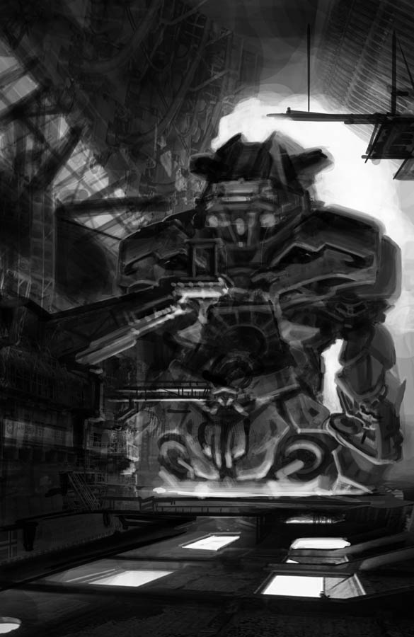
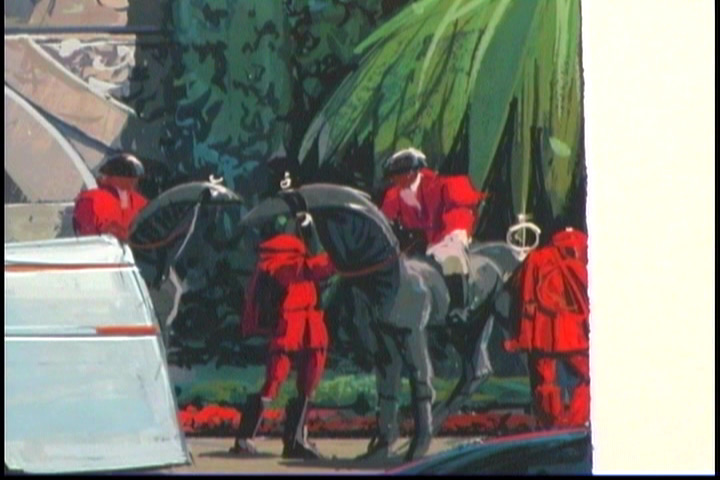
The last thing like that Khang does is he always puts in as the very top layer an Adjustment:Hue/Saturation Layer with the Saturation turned all the way down to zero. By turning it on and off, you can quickly check to see if you're maintaining your value relationships correctly, which is critical to making your composition read. Here's what my image looks like with zero saturation:


Looks like it's reading pretty well. I need a bit more of a gradient from bottom to top on the robot figure, the upper parts seem like they're reflecting more of the lower light source than they should. It's not as obvious in the color version but it's very plain here. The lighting won't look realistic if it doesn't fade naturally with distance from the source, so I will need to deal with that as I go forward.

Khang's techniques are very different from another artist whose techniques I use a lot: Ryan Church, who generally works in very few layers and flattens the image over and over again without saving as a new file. That's another way to always go forward, but I sometimes find myself getting mired in tweaking detail. I'm not as confident in painting as Ryan is... but then, he's got a good 15 years on me, probably a bit more. :) I'm better doing it that way if I've done a tight line drawing first; Khang's method allows me to start from a simple light/dark mass layout and build without a drawing, but still get interesting detail and shape in a very short time. Good to know.

Why another master copy? Baby steps. I wanted to get some experience using Khang's technique and "processing" the image-making in my brain before I start trying to apply this to some original works. Actually, I have already applied it to an illustration assignment with success, but I have to wait to show you that until the project is published.

So hey thanks Khang, if you're out there! :)

I have Dominance War IV challenge to do coming up, and I'll be painting it live on UStream again, so keep an eye on this blog or follow me on UStream, Twitter or Facebook to know the schedule.

Labels: , , , , ,

Wednesday, January 02, 2008

Master Copy

Over the holidays I had some art time, yay! I did a bunch of sketching. Also, I did a fun thing, a "master copy" of a Syd Mead piece, the one that's featured on his Gnomon DVDs.
Specifically, I followed along with the Step 3: Color Preliminary DVD.


Here's a shot of Mr. Mead's final for comparison:


You can see I didn't nail it exactly, the color of the stone is off and the vehicle proportions are wrong. I wasn't really trying to perfectly duplicate this, I just wanted to try painting with gouache, which is what Mr. Mead has used for his whole career. It's a very different thing, painting with a brush on art board, compared to digital, and completely new to me; I've never used gouache before ever. Rather than try to learn the paint while also struggling to design a nice image, I decided to copy this one.

It's a standard practice among art students to do master copies, and I sure learned a lot from it. It was fun! Gouache is reputed to be really difficult to work with, but I didn't find it too hard once I got going. The key thing is the consistency or thickness of the paint. If it's too dry and gooey, it doesn't spread well and gets lumpy. If it's too wet and thin, it can lift up any color beneath it and cause bleeding. There's a definite sweet spot where the paint is just right, and that's sort of hard to hit unless you mix up a big batch of whatever color you're using, rather than mixing small amounts on your palette.

Here's some details:


Compare to a similar detail from Mr. Mead's piece:


A couple more of my details:


So that was really enjoyable, I have to do some more pieces with gouache. Next time I'll try something I design myself.

Labels: , , , ,

Monday, December 17, 2007

More Sketches

Yep, more sketches. I have a lot more than these but I can't really put them all online. Most of them are pretty boring exercises in construction or light and shade (or both), kinda like this one:


Doing a lot of airplanes, because I've been watching the Scott Robertson DVD on aircraft. Mine are not so fanciful as his. However, airplanes are excellent practice for drawing 3D forms with accurate perspective.


Pulled one of these planes out and cleaned it up on tracing paper:


I traced this plane off a very messy scribbly sheet of sketching, I liked the shape:


So I went ahead and did a more elaborate drawing, which turned out with parts that aren't right:

Somewhere during this drawing, I came up with a sort of story idea where this plane is going to try to be the first prop-driven aircraft to break the sound barrier in level flight. Actually I think that may be physically impossible (though it was apparently done a few times in steep crash dives during WWII), but it's a fun sort of romantic extension to the old prop-plane/barnstormer sort of tradition. So this is a plane that's got a really huge powerful engine with two counter-rotating props to partially offset the massive engine torque, and some fancy swept-serrated wings like a jet fighter, with control surfaces that are more like modern supersonic fighters - the older control surface systems don't work well up around and beyond 1.0 Mach because the physical airflow forces are much different from subsonic flight. But I digress...

Anyway, I could see that the drawing was off, so I laid out a more formal perspective grid and got it more accurate:


I guess it's hard to see since this isn't a completed line drawing, but the wing on the right was too long in the first drawing, and some of the details at the front weren't in proper perspective. I tried to correct all that. I spend a lot of time trying to get the prop ellipses right drawing by hand; I don't have ellipse guides that big (this sketch fills a sheet of 9x12 marker paper) so I'm gonna have to check them in Illustrator or something.

Eventually I wound up with this side view, which I rendered quickly with marker:

I'm still gonna go back and work the previous sketch, most likely doing a layout in Illustrator and then ink drawing in Painter. Might go on to do a full photo-real rendering too.

I was also watching my Syd Mead DVDs again, and among other little drawing notes, I made a couple of "master copies" of the "Sport Hypervan in the DuPierre Equine Courtyard" image value comps:


The Hypervan isn't really drawn in the right proportions, but these were still fun, quick and good exercises. Someday I'll have that kind of layout and design sense...

Labels: , ,

Tuesday, December 11, 2007

Sketchy Dumpy

As you know I'm working hard on rebooting core skills, so I've been doing a lot of sketching. Basically I'm working from the Gnomon Scott Robertson DVDs, the ones on basic perspective drawing and shading. This week, mostly on the perspective stuff. Here's some of the better pages:


Getting the ellipses right in freehand is really hard, but it's something I have to master. You can see the wheels on the car above aren't quite right, and the prop on the shaded airplane in the next image up is off. I'll take these into my programs and correct them so I know where I messed up.

All circles drawn in perspective become ellipses; so for things like wheels and any other circular item you have to master nailing exactly how the ellipse looks in that view or it's just off. Even people who know nothing about this sort of drawing know that the wheels are off, because we all see wheels every day... so this ain't something you can slack on. Of course I can nail them digitally, but that's too easy. :)

I really like the plane on the right in the next-to-last image, that came out really well. For that one I drew the prop ellipse first, using an ellipse template; see how much more "right" it looks?

Labels: , ,

Thursday, November 29, 2007

Thursday is Art Night: More City Gates

I decided that tonight was going to be "Art Night," and that I was just gonna come home, eat a quick dinner and then crank on some arting. Here's the results as of 10:30pm:

First, a bit of warmup...

Working on making 3D cubes and then lighting them properly. It's good warmup for my hands. I recently noticed that I hold a pencil or pen differently from how I hold my digital tablet stylus; the stylus is thicker so I wind up with my first and second finger both on the barrel, as opposed to only the first finger. I find that I grip a pen or pencil much, much harder, but if I instead hold it like my stylus, my grip immediately loosens - which smooths out my lines considerably. Too much muscle tension is bad, can even cause carpal tunnel.

Then, I put about 90 minutes into the City Gates color pass, while running the Syd Mead color preliminary DVD in the background...


I think it's starting to look a lot better. Now that I'm putting in these saturated greens in the foreground, the middle ground of the gate structure is looking a bit too sharply defined and saturated. I'm gonna have to knock that back to give some distance, some atmospheric perspective. It needs to look halfway between the far buildings and the foreground. It's actually quite some distance away, the inside of the tunnel roof is something like 30 or 35 meters high so it's gotta be around a kilometer away from our viewpoint. Each of those horizontal bars to either side of the rounded gate is a balcony, so the walls are about 7 or 8 stories tall.

It's nice to get some stuff done. I'm gonna spend a little more time tonight just sketching.

Labels: , ,