Monday, June 22, 2009

Design Project: Military Hovercraft, Marker

Here's the hovercraft done in a marker rendering:


Used Prismas and Copic markers over a copy made on my new printer - the inks don't smear when markered over, which is great. Hit it with a bunch of ProWhite for the splashes and highlights.

Labels: , , , , ,

Monday, June 15, 2009

Spaceship Sketch

Here's a spaceship thing I did for fun while at a meeting.


I draw a lot of spaceships.

Labels: , , , , ,

Thursday, June 11, 2009

Design Project: Military Hovercraft

I came up with this idea about a year ago but never rendered it; it popped into my head last night so I decided to draw it. I couldn't find the rough sketches so I had to do it from memory:


I like this better than the first sketch ideas that I remember, actually. This vehicle is kind of like a hovercraft version of a jeep or HUMMV with a machine-gun mount (reminiscent of Halo's Warthog, to be sure, heh), but not a sci-fi vehicle, it's something that probably could be built with existing tech. It's powered by turbines (jet engines) like the M-1 Abrams tank, using the jet power to both move the vehicle and inflate the air cushion. The weapon mount is two Browning .50-cal on a motorized rotating mount for 360-degree field of fire. It could carry a jeep-like cargo load or 4, maybe 5 fully-equipped troops on the rear flatbed.

The US Navy has a very large version of this sort of thing, the LCAC, for landing Marines on the beach. They're pretty impressive if you ever see one, much larger than you'd expect. There's an LCAC squadron hangar on the way to San Diego, right by the I-5.

Marker-rendered version to follow soon. Also, I had an idea for a 4-wheeled armed rough-terrain vehicle at about the same time, which I actually partly built in 3D, which will be the next design project.

Labels: , , , ,

Tuesday, May 26, 2009

Design Project: Planet Exploration Vehicle

I asked my esteemed colleague 
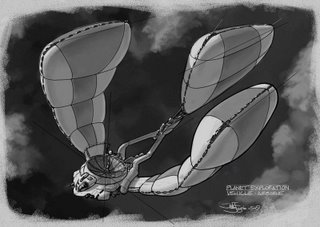
Kevin (who is currently kicking my ass with his output, so I gotta catch up) to throw me out an assignment off the top of his head, and he IMed back "Planet Exploration Vehicle." So here is one of those:


I saved out many progress images in case anyone wants to see the process. I'm trying to work in something similar to the Doug Chiang way, so...

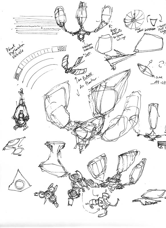
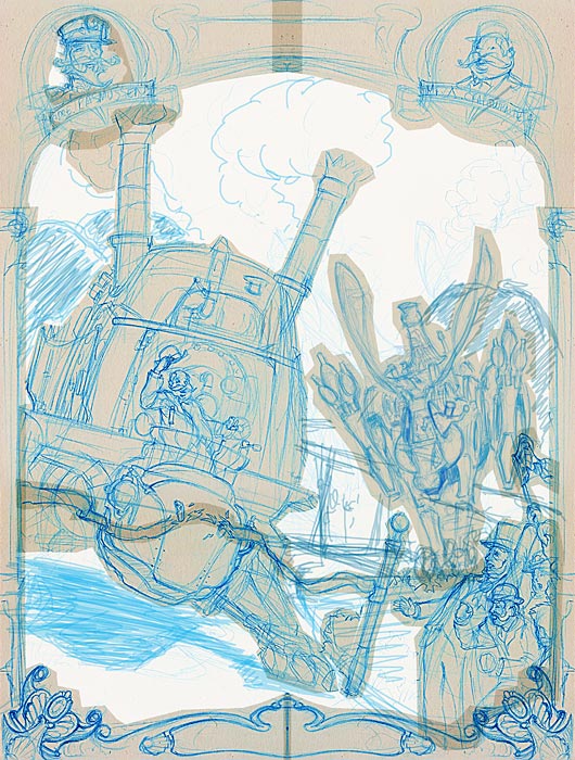
1. I started with a really rough page of thought-scribblings, going with the first shape that popped into my head, which you'll see in the middle of the page.

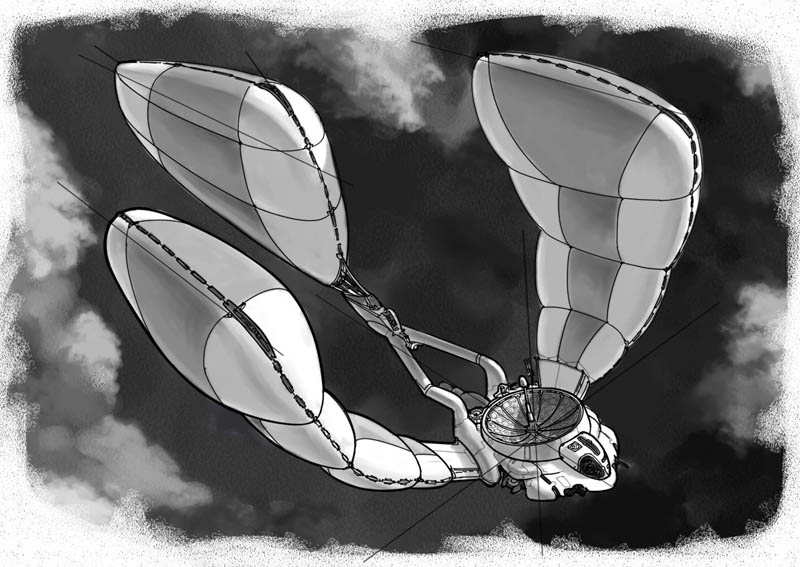
The first thing that came to me was "aerial automated probe for dense-atmosphere planets." I made some notes about how I thought it might work: nuclear-reactor powered, the reactor runs a jet engine and a compressor to inflate/deflate the balloon/wings, attaching small fast drone planes for flying out to gather info, other stuff like that.

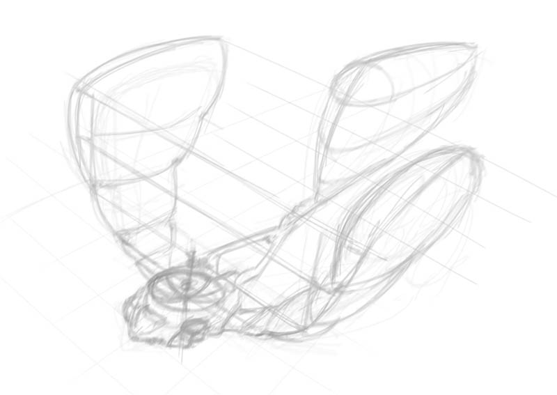
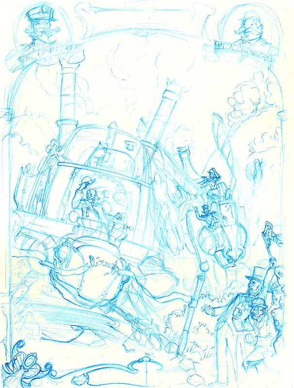
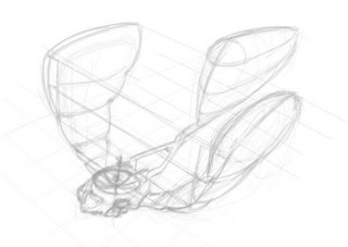
2. First quick marker layout - actually I did all this digitally in Painter, so it's not really a "marker," but this is still how you do your first layouts, with a light gray 10%-30% marker to whip up a quick sketch:


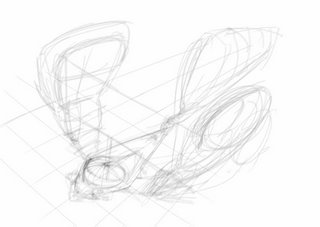
3. Next, on a new layer, a cleaner version of that super rough marker:


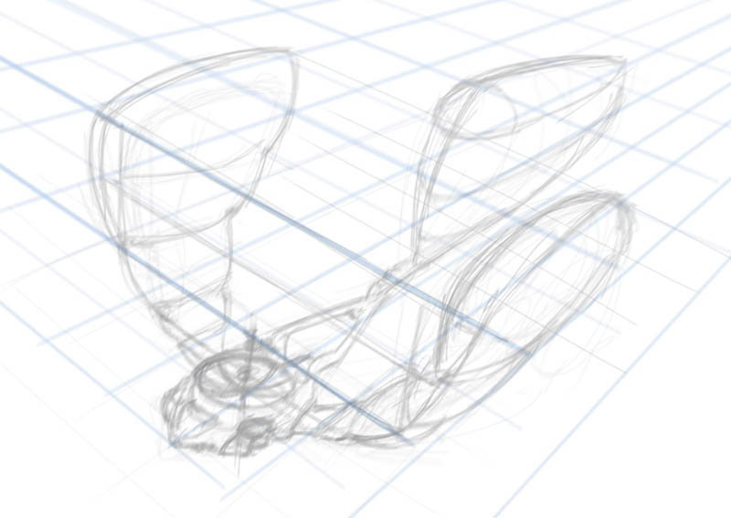
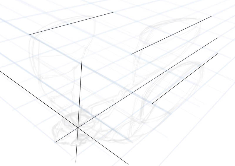
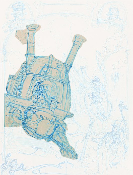
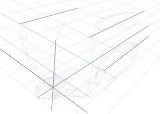
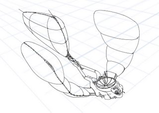
4. Now, lay in some fairly accurate perspective guides - to do this, I added a lot of canvas to the image so I could make a horizon line and vanishing points which are very far off the "page" of this drawing.


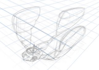
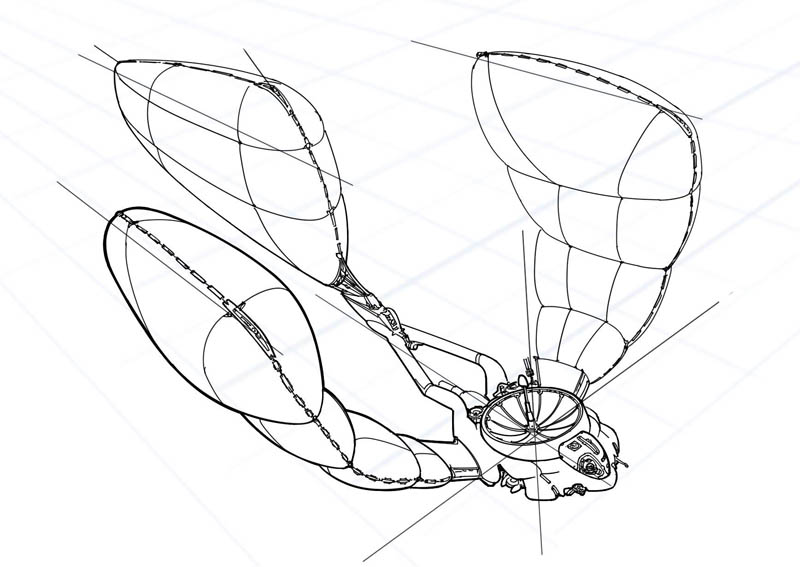
5. Chiang does a thing where he lays in very strong clear "centerlines" of some of the important components of whatever he's drawing, so I do that here. These lines stay in the final image, but I still put them on a separate layer in case they don't work for me.


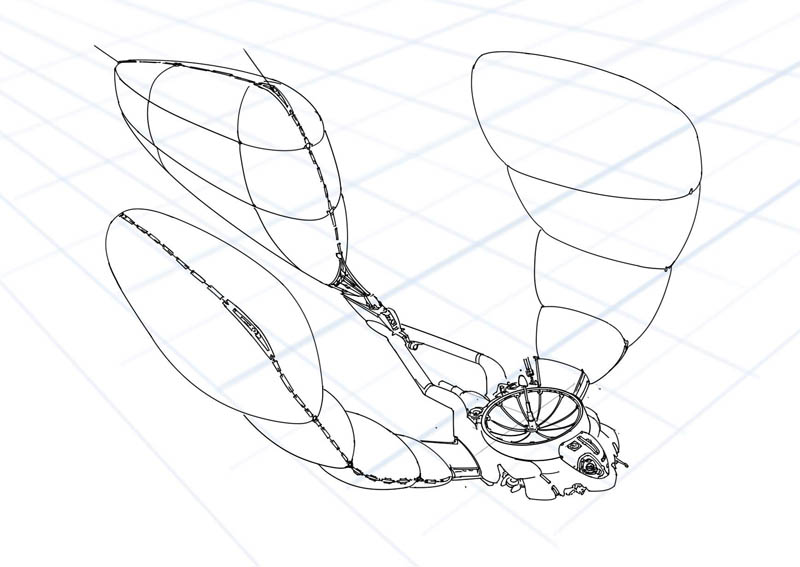
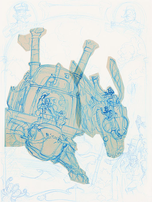
6. Time to do some inking. This is pretty straightforward, just using my "ID Pens" in Painter. I flipped the image to make sure nothing was off - something I do a lot, it's easy when you're digital. I flip 6 or 8 times during every stage of this process!


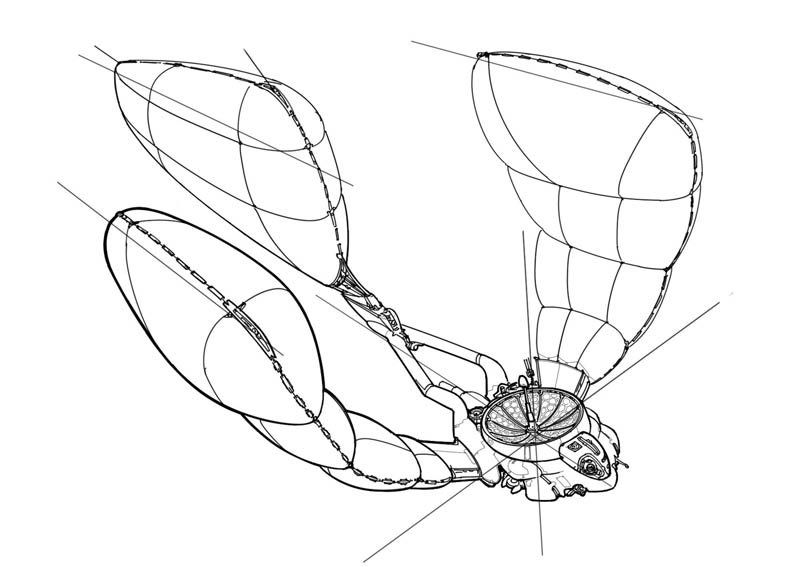
7. More inking. Adding more detail, thickening some lines.


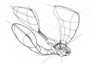
8. Final inking. Just added some small detail here, like in the antenna dish.


9. Marker rendering. This actually took 4 passes, because the first 3 sucked. Painter's "marker" tools are not quite like real markers, so I tried a number of approaches including using the watercolor brushes instead. Eventually I saved my own marker brush variant and did some major tweaks in the Brush Creator to make it behave much more like a real marker, and finally got something that satisfied me:

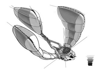
You can see I put in some color swatches there to pick from. They're 10, 30, 50, 70 and 90%, just like the real-life Prisma and Copic markers I use on paper.

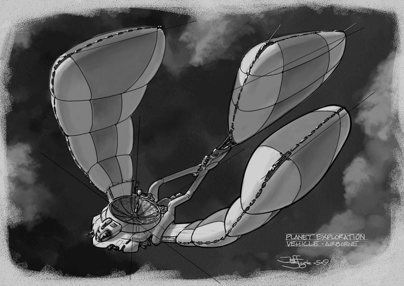
10: Add a background - this thing looked boring on white, so I put in a layer underneath all the art and made a dark, cloudy bg using watercolor and chalk brushes plus a special cloud brush I adapted from David Levy's Photoshop brush set.


11. Final Image. I wanted to put white highlights on with "gouache," so I had to actually knock back the 100% white of the drawing. It's harder to do this in Painter than in Photoshop because the Contrast tools don't affect pure white. Instead, I made a new layer above the grayscale work, filled it with 5% gray, set it to Multiply and then flattened it down. Then I used a "gouache" brush with pute white to drop in some overlaid highlights.

Title it, sign it, date it, it's done. So, there's a design 3/4 drawing for this PEV. The next step will be a full-color paint in the target environment and a set of orthographic drawings. This view doesn't show many details of the construction that I see in my head, nor does it explain things like how the dish antenna actually flips itself over to streamline the plane for high-speed flight. Thus it's not enough for a modeler to build it to fit the "story."

The final paint will show both high-speed (balloons deflated to wings) and this low-speed configuration, with a bottom 3/4 view showing underside details and one of the little drones flying out to investigate something.

I'm gonna wait a bit on the final paint though. I want to get more design work done on different ideas that I have.

Hope you like this thing and a look at the process.

Labels: , , , , , ,

Tuesday, May 19, 2009

Sir Sketchalot

While you're waiting for the next comic, here's a few things from the giant stack of sketching I've been doing, on paper with markers:

Automated street vacuum:


Some kinda machine-y thing:


Dog-like mech:


I'm both going back to some of my sketching roots and working to be in Doug Chiang space. Trying to learn to get the same kind of look that Chiang gets with markers, which seems very specific - haven't quite found it yet. He's working the marker in a way that gets a crisp smooth wash.

Lots more to come, soon.

Labels: , , , ,

Sunday, January 04, 2009

Steampunk Challenge - Layout "Finalized"

Time is up for doing layout, so here's what I'm going with:


The Hare has been redrawn from scratch. TGF pointed out that the previous pose could be stronger and bring the eye back into the image, so I quickly redid the sketch, then moved it around until it looked okay to me.

IMO, this still may not be the best solution to my illustration problem, but it's strong enough to stick with it. I'm going to keep everything on layers, which I don't usually do, in order to allow some tweaking later on.

Time to start painting! Wish me luck...

Labels: , , , , ,

Friday, January 02, 2009

Steampunk Challenge - First Steps

Right, so, holidays are over. Back to work!! I only have 9 days to complete my challenge entry, so it's time to just do the painting. I'm starting out with a rough layout sketch in blue pencil on 9x12 Bristol paper:


This is kinda what I saw in my head when I first thought about the Tortoise vs. Hare theme. It's a start, but I'm not sold on it. I've scanned it into Photoshop, so now I'm going to cut out the main components of the image so I can play with them and move them around. First the Tortoise:


And then the Hare:


I'm using Ctrl-J to duplicate the selection to a new layer. Since there's a lot of tone to the original scan, it's giving me kind of an old-timey tracing paper look, which I think is fun.

I did the lower left scrollwork more completely than the right, so I select, duplicate, flip and move it to mirror to the other side:


I like the shape of the picture oval at top right better, so I do the same and mirror it to the other side. Then I erase the mirrored Mr. Crabthwaite...


...and paste in the Commodore instead. I'm really diggin' the tracing paper vibe, reminds me of doing stuff like this when I was a kid:


So here's the main meat of what we've got, the two contestants and the frame. I'm going for a really 19th-century poster or playbill or even newspaper look, basing on things like Barnum & Bailey Circus posters:


At this point I'm not liking how big the Hare is. Even though the contraption is inherently much larger than the Tortoise, the scale is feeling odd to me and I can't really seem to get a handle on how the road underneath it is going. So I'm gonna make the Hare smaller to push it back and allow me to show more of the road, while also really roughly sketching in some of the landscape:


There, that's better. I think this is a workable layout. Then I think to myself, well gee, there's not a lot of crowd showing - you'd think this race would have a pretty good turnout at the finish line. And maybe the whole image is a bit squashed? What would it look like if I changed the aspect ratio to a wide view? Photoshop magic, commence:


I roughly doubled the width of the image and spread everything out a bit, then re-sketched the rough background. You can see there's lots more crowd and a much clearer view of the whole road. We lose some sky but maybe I can re-work the landscape... oh wait. There's way too much dead space to the right of the Hare. Crop tool time...


OK, that's better. Looks more balanced to me. I've got some triangular composition going between the Tortoise, Hare and the guy with the finish flag. The curves on the road guide the eye better, I think. This is workable too.

Now, decision time. I have 9 days. Do I really want to paint a big crowd of people? That takes time. Can I figure out some painterly shortcuts to speed that process up? Maybe. I'll sleep on it, but at this point I'm leaning toward staying with the vertical layout and finding a way to compress a feel of more crowd and also a better suggestion of how the road works in there.

More tomorrow...

Labels: , , , , ,

Thursday, December 18, 2008

Steampunk Challenge - The Hare

Here's the next bit of concept work for the Steampunk Challenge. We have our Tortoise, so here's the Hare:


I actually did another version of this first, a more "iron" mechanical clanking monstrosity:


...but TGF pointed out that it didn't really look much like a hare. I realized at that point that I'd gotten a bit lost in the mechanical details and thoughts of "how would it work" rather than "what will look right for my image," so I stopped and did the second version, which I like much better.

I'm sure I went a bit overboard on the details of the second one, but these drawings are just to get the visualization of what the thing might look like in my head. I'll keep the large shapes, but I'll cherry-pick the details in the final image to make it look balanced and consistent.

Next up, layout for the final painting.

Labels: , , , , , ,

Thursday, October 02, 2008

One from Way Back

Mom is moving to a new apartment, so she's been going through stuff. I guess she's found a few of my old drawings, she just emailed me this one from 1979:


I guess you can kinda see where I was at back then, huh. :)

Labels: , , , ,