If you are an artist of any kind, especially in a professional capacity, you must get very good at playing the game "What's Wrong With This Picture." Even if you've been doing it for years, you will very often work for quite a while on an image before looking at it and saying to yourself, "there's something not
quite right about this, but I don't know what." 99% of the time, your instincts are correct - there's something off and you're missing it. I'm not talking subjective things like maybe you'd rather the car be blue than red, I'm referring to structural errors like incorrect perspective or lighting, shadows in the wrong place, distortions, and subtle things like uncomfortable proportions, anatomy that isn't working... or the most deadly, the image isn't actually telling the story that you want to tell.
It's not so important with expressive fine art or personal work, but if you're making a picture or illustrating a concept that you're trying to sell, it is vitally important that you figure out what's wrong and fix it. The last thing you want is for your client to look at the picture and say "hmm, there's something
wrong with this, I don't know what it is, but it makes me not want to buy it."
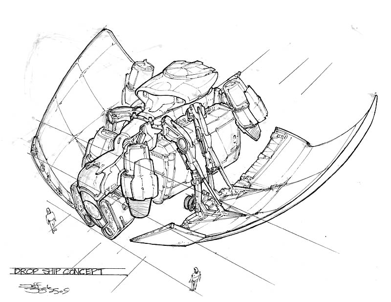
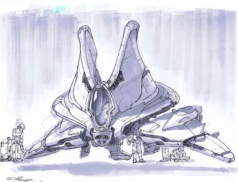
I thought I'd share an instance of this that I've just experienced. Here's a picture I drew last week:

I had this idea for a sci-fi "dropship" vehicle, a military troop transport that drops from space down to a planet surface loaded with troops, equipment and maybe vehicles, similar to the role of our modern Blackhawk helicopters or C-130 airplanes. The film
Aliens probably has the coolest example of this kind of vehicle. So the thing has to enter an atmosphere, find a landing zone, and deliver the troops and hardware.
Now, there's nothing really egregiously wrong with the above sketch. It looks like a military spaceborne dropship. You can see the cockpit, thrusters, cargo pod, the big wings, and a couple of guys for scale. The perspective is pretty good, the linework is solid.
But when I was finished with it, I knew it wasn't right, and so I had to play WWWTP?
OK, so there's nothing intensely wrong with the drawing. The rear starboard thruster is a little off in placement, not a big deal. Hmm, the cockpit seems a little "fat" compared to what I saw in my head, is that it? Hmm... are my scale guys too small? I know I messed up the starboard wing in perspective at first (you can see the marker sketch goes out too far), but I fixed that... what the heck is wrong??
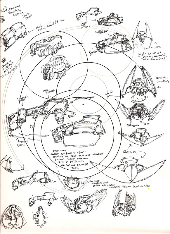
To show you, I have to show you the sheet where I was scribbling rough ideas:
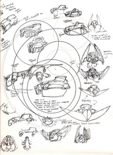
Here I'm playing with the idea in my mind on a piece of scrap paper, you can see I was testing a new compass on it first. Can you see what's wrong with the first picture yet?
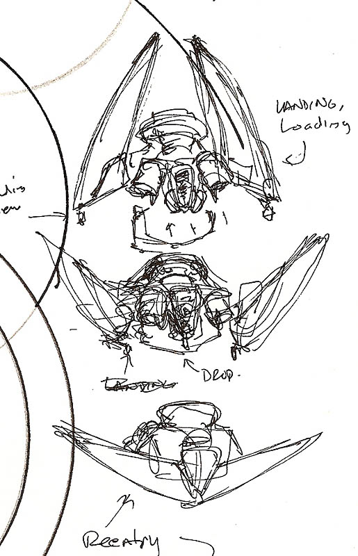
If not, the problem is made clear by this detail from the scribble page:
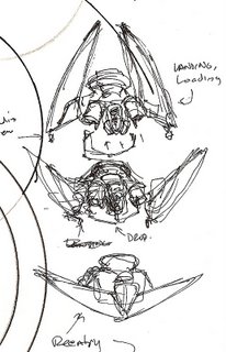
The "core" feature of this vehicle in my imagination was that the "wings" are a movable re-entry heat shield, which is closed as the ship hits the atmosphere, acting just like the tiles on the Space Shuttle, absorbing and deflecting the extreme heat of friction. Perhaps they have some ability to control the path of the ship as it slows down, via slight warping of their shape. Once the ship is near landing, the wings open up and the ship slows down with the thrusters until it lands. While it's on the ground, the wings act like armor, adding protection for the troops as they disembark.
When I looked back at this initial sketch, I realized what was wrong: I had failed to show the ship at an angle that shows off its best "look."
See, with those wings open, the ship has (in my opinion anyway) a really cool silhouette. It's got a kind of bat-wing effect, it looks sinister and menacing. If you were on the ground seeing these things coming down, it would be scary to watch the wings open like claws or jaws and spread out, with the thruster rocket exhausts looking like giant flaming teeth shooting out between them. From the front, the ship has a distinctive and interesting shape, which also (hopefully) has a psychological effect on the viewer.
In the first sketch,
you see none of that. It's just not an exciting drawing, and it completely fails to show the most important aspects of the ship's function which is plainly clear in the scribble showing the different wing configurations. And really, it doesn't show the overall shape of the ship very well, you can see that the body of the ship is just kind of a blob of shapes in an uninteresting, almost rectangular outline. It is, frankly, kind of boring apart from a few details here and there. I made the deadliest mistake - I didn't tell the story that I wanted to.
Well that certainly won't do. The client isn't going to buy that - especially if another artist on the team has done a better drawing. If the client does buy it, they won't be excited about it. If I were lucky and this thing was chosen, nobody would see how it worked until it was built in 3D and put into the game or show, which might be months from now.
When it's wrong, you have to throw it out and do it over again. Which sucks. But you absolutely must be ruthless about cutting away anything that isn't right. It doesn't matter if you spent all day or all week on the image - if it's wrong, toss it and draw it again.
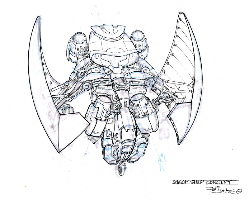
So I did:
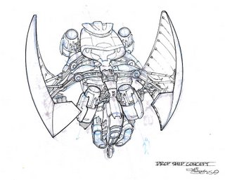
MUCH better. The silhouette is now obvious. Even the core body looks better. I've kept the interesting details of the upper part of the ship. It should be pretty clear that the wings are on hinged arms that allow them to open and close. The ship looks far more menacing and even though you can see the landing gear is down and maybe it's sitting still on the ground, it still has a sense of movement and flying, because the shape just says "I'm fast and dangerous and I bite." To be absolutely sure the idea gets across, I can easily paste the detail from the scribble sketch onto this picture to plainly show the different wing configurations.
This thing would look cool in a movie scene or a video game... but you can't see that at all from the first drawing!
I learned a lot from this, I feel like I took a step that I might not have 6 months or a year ago. It may seem kind of obvious (especially to my professional colleagues), but it's still really easy to get wrapped up in technique or details and forget what you're really trying to communicate. That's exactly what I did in this case, and I'm glad I caught it. From a FAIL to a WIN!
That's why an artist has to play WWWTP
constantly, at every stage of picture-making. You won't ever get the coveted "Fabulouso!" stamp on your drawing if you don't.
Labels: concept, design, sci-fi, sketches, vehicle, what's wrong