Steampunk Challenge - First Steps
Right, so, holidays are over. Back to work!! I only have 9 days to complete my challenge entry, so it's time to just do the painting. I'm starting out with a rough layout sketch in blue pencil on 9x12 Bristol paper:
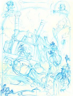
This is kinda what I saw in my head when I first thought about the Tortoise vs. Hare theme. It's a start, but I'm not sold on it. I've scanned it into Photoshop, so now I'm going to cut out the main components of the image so I can play with them and move them around. First the Tortoise:
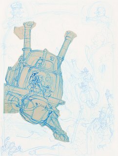
And then the Hare:
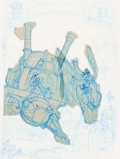
I'm using Ctrl-J to duplicate the selection to a new layer. Since there's a lot of tone to the original scan, it's giving me kind of an old-timey tracing paper look, which I think is fun.
I did the lower left scrollwork more completely than the right, so I select, duplicate, flip and move it to mirror to the other side:
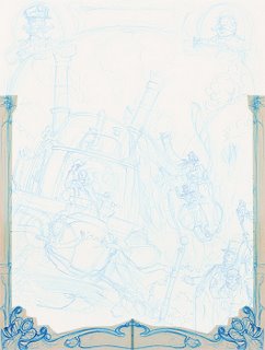
I like the shape of the picture oval at top right better, so I do the same and mirror it to the other side. Then I erase the mirrored Mr. Crabthwaite...
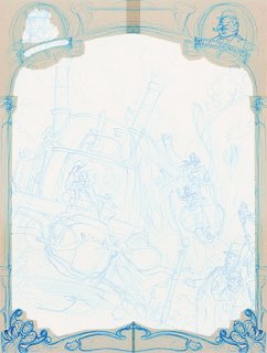
...and paste in the Commodore instead. I'm really diggin' the tracing paper vibe, reminds me of doing stuff like this when I was a kid:
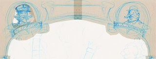
So here's the main meat of what we've got, the two contestants and the frame. I'm going for a really 19th-century poster or playbill or even newspaper look, basing on things like Barnum & Bailey Circus posters:
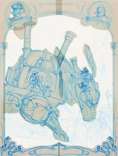
At this point I'm not liking how big the Hare is. Even though the contraption is inherently much larger than the Tortoise, the scale is feeling odd to me and I can't really seem to get a handle on how the road underneath it is going. So I'm gonna make the Hare smaller to push it back and allow me to show more of the road, while also really roughly sketching in some of the landscape:
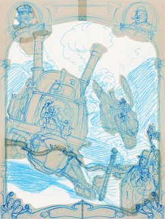
There, that's better. I think this is a workable layout. Then I think to myself, well gee, there's not a lot of crowd showing - you'd think this race would have a pretty good turnout at the finish line. And maybe the whole image is a bit squashed? What would it look like if I changed the aspect ratio to a wide view? Photoshop magic, commence:
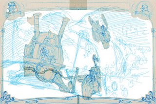
I roughly doubled the width of the image and spread everything out a bit, then re-sketched the rough background. You can see there's lots more crowd and a much clearer view of the whole road. We lose some sky but maybe I can re-work the landscape... oh wait. There's way too much dead space to the right of the Hare. Crop tool time...
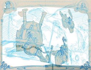
OK, that's better. Looks more balanced to me. I've got some triangular composition going between the Tortoise, Hare and the guy with the finish flag. The curves on the road guide the eye better, I think. This is workable too.
Now, decision time. I have 9 days. Do I really want to paint a big crowd of people? That takes time. Can I figure out some painterly shortcuts to speed that process up? Maybe. I'll sleep on it, but at this point I'm leaning toward staying with the vertical layout and finding a way to compress a feel of more crowd and also a better suggestion of how the road works in there.
More tomorrow...

This is kinda what I saw in my head when I first thought about the Tortoise vs. Hare theme. It's a start, but I'm not sold on it. I've scanned it into Photoshop, so now I'm going to cut out the main components of the image so I can play with them and move them around. First the Tortoise:

And then the Hare:

I'm using Ctrl-J to duplicate the selection to a new layer. Since there's a lot of tone to the original scan, it's giving me kind of an old-timey tracing paper look, which I think is fun.
I did the lower left scrollwork more completely than the right, so I select, duplicate, flip and move it to mirror to the other side:

I like the shape of the picture oval at top right better, so I do the same and mirror it to the other side. Then I erase the mirrored Mr. Crabthwaite...

...and paste in the Commodore instead. I'm really diggin' the tracing paper vibe, reminds me of doing stuff like this when I was a kid:

So here's the main meat of what we've got, the two contestants and the frame. I'm going for a really 19th-century poster or playbill or even newspaper look, basing on things like Barnum & Bailey Circus posters:

At this point I'm not liking how big the Hare is. Even though the contraption is inherently much larger than the Tortoise, the scale is feeling odd to me and I can't really seem to get a handle on how the road underneath it is going. So I'm gonna make the Hare smaller to push it back and allow me to show more of the road, while also really roughly sketching in some of the landscape:

There, that's better. I think this is a workable layout. Then I think to myself, well gee, there's not a lot of crowd showing - you'd think this race would have a pretty good turnout at the finish line. And maybe the whole image is a bit squashed? What would it look like if I changed the aspect ratio to a wide view? Photoshop magic, commence:

I roughly doubled the width of the image and spread everything out a bit, then re-sketched the rough background. You can see there's lots more crowd and a much clearer view of the whole road. We lose some sky but maybe I can re-work the landscape... oh wait. There's way too much dead space to the right of the Hare. Crop tool time...

OK, that's better. Looks more balanced to me. I've got some triangular composition going between the Tortoise, Hare and the guy with the finish flag. The curves on the road guide the eye better, I think. This is workable too.
Now, decision time. I have 9 days. Do I really want to paint a big crowd of people? That takes time. Can I figure out some painterly shortcuts to speed that process up? Maybe. I'll sleep on it, but at this point I'm leaning toward staying with the vertical layout and finding a way to compress a feel of more crowd and also a better suggestion of how the road works in there.
More tomorrow...
Labels: challenge, drawing, entry, sketches, steampunk, tortoise

0 Comments:
Post a Comment
<< Home